Finland’s future fund
Our future is influenced by climate change, the digital transformation, population diversification and a wide range of other phenomena. At Sitra, we engage in foresight activities and collaborate with partners to find solutions to make the future fairer and more sustainable. In other words, Sitra is Finland’s future fund.
Having a strong brand is important for us. Recognisability opens doors and makes co-operation easier. This is why we always operate under the Sitra brand. We do not, for example, brand our projects as activities that are separate from Sitra’s operations.
As Sitra’s image is being continuously built through dialogue with various people, every action by Sitra and every encounter with Sitra is meaningful.
The guiding principles of everything we do are sustainability, responsibility and accessibility. For us, being sustainable and responsible also means being economical.
Your message is your attitude
Hey, you! Yes, you! Like any other organisation, we want our communications to attract your interest and people’s interest in general. What sets us apart is an attitude of courage, expertise and inspiration that we try to convey in our messaging.
Are you tired of the non-stop stream of communication coming your way? We’re with you on that one. That’s why the focus of our communication is on quality instead of quantity. High-quality communication stands out, attracts interest and stimulates dialogue and action. This is our goal.
To us, impactful communication is communication that puts the target audience first, is human-to-human, topical, fact-based, positive in tone, solution-oriented and story-driven. It also has the courage to address topics. We avoid negativity, blame, moralising, dictating, denying and explaining things in a way that is difficult to understand.
Ultimately, everything starts with the message and the creative idea that emerges from it. If the message is unclear or the idea is absent, the future fund’s communication will not be as intended.
Tone of voice
We put the future into words, so our choice of words matter. Even when discussing complex topics, we make them interesting and motivating by expressing things clearly, concisely and using relatable examples.
If Sitra were a person, they would be a person characterised by courage, enthusiasm, expertise and fairness. Their use of language would be witty and clever without resorting to empty slogans or unfounded remarks. Officialism, hard-to-understand expressions and research jargon are a bad habit that we try to rid ourselves of.
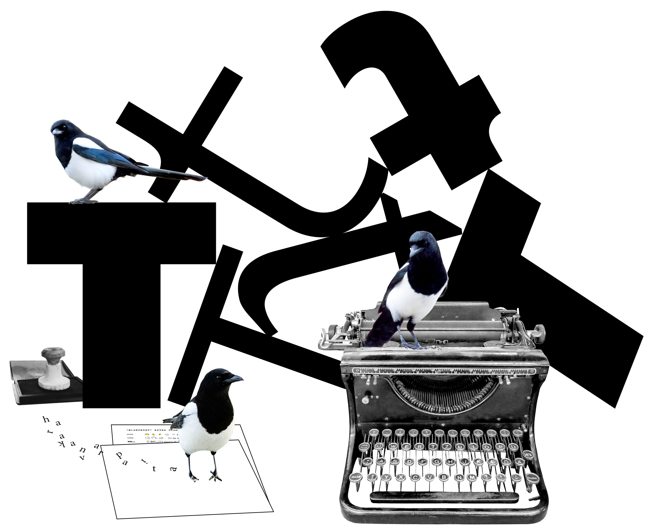
Images
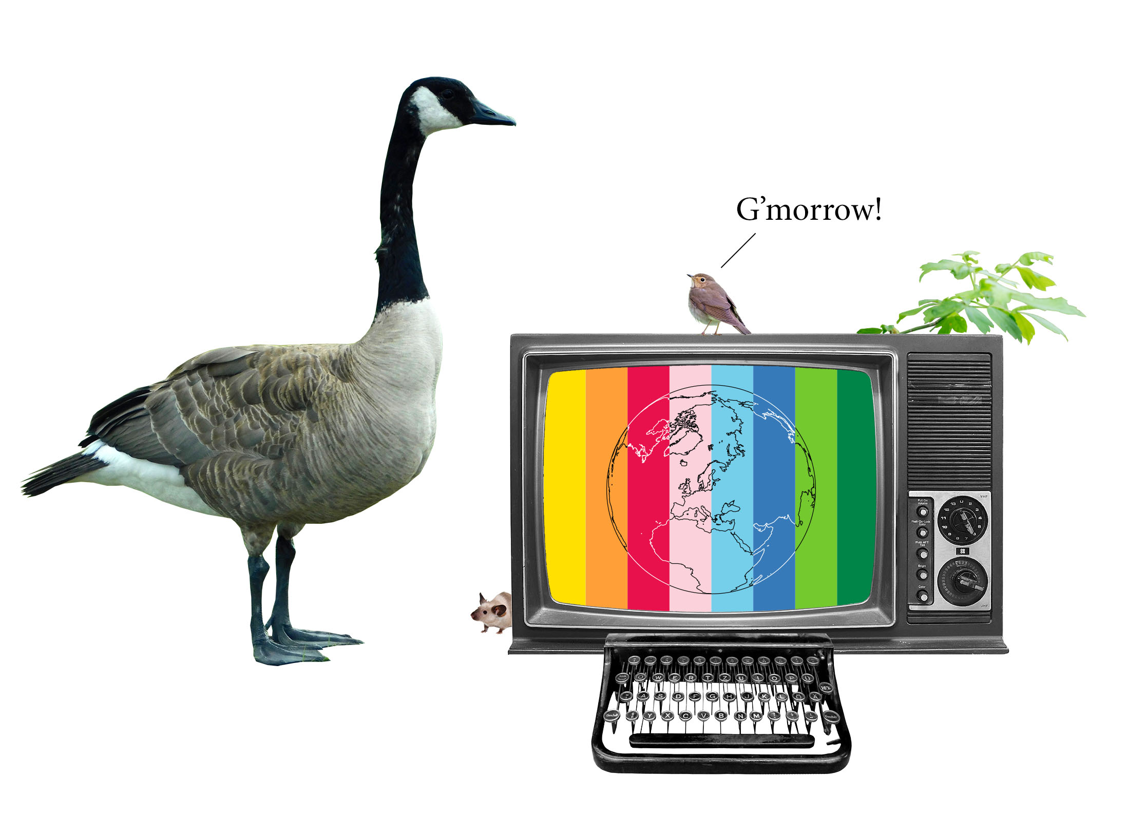
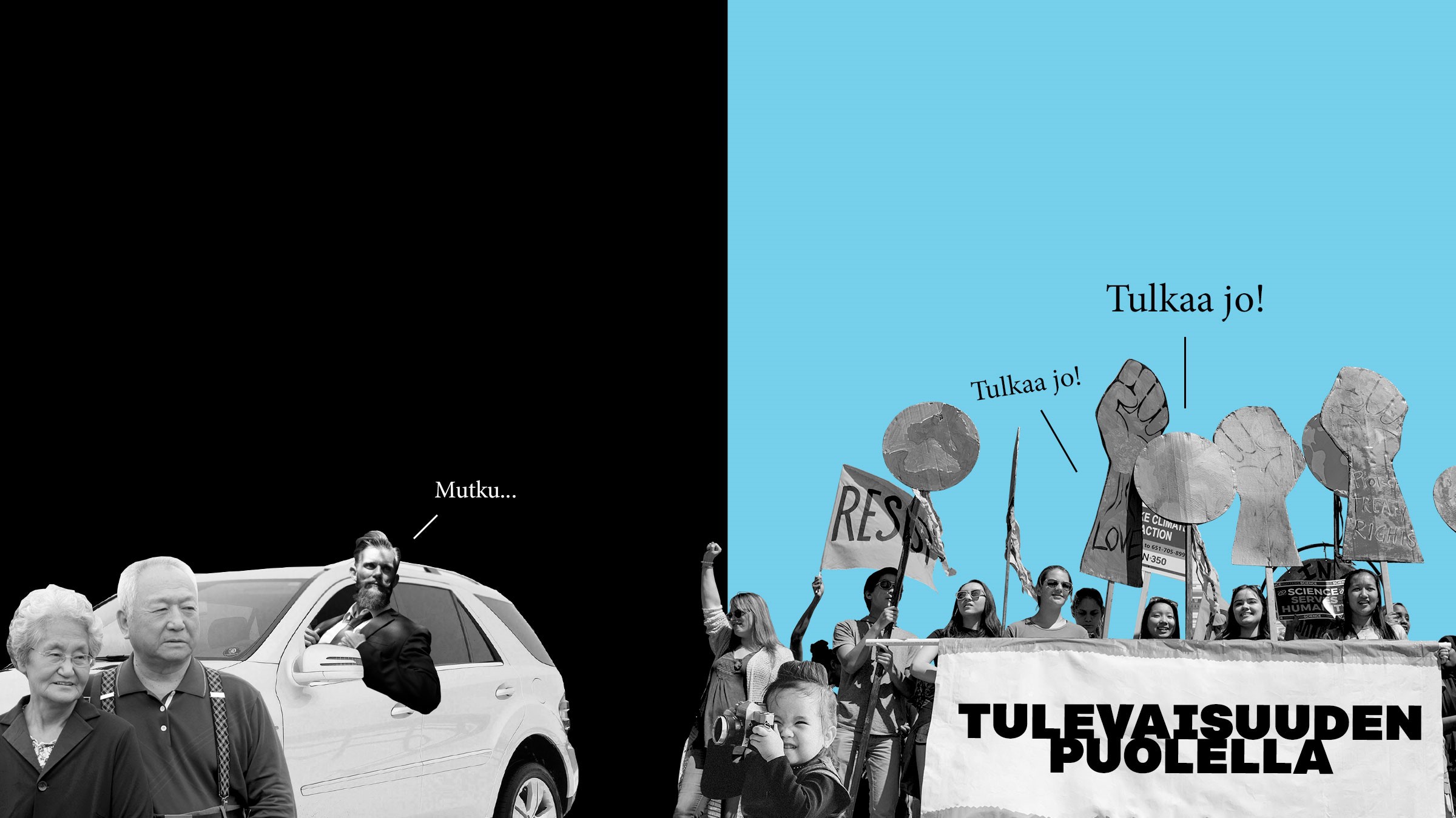
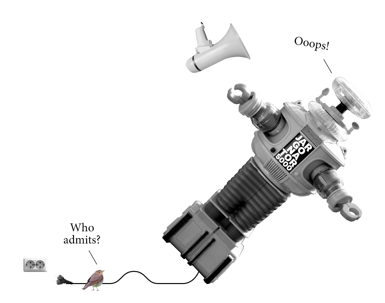
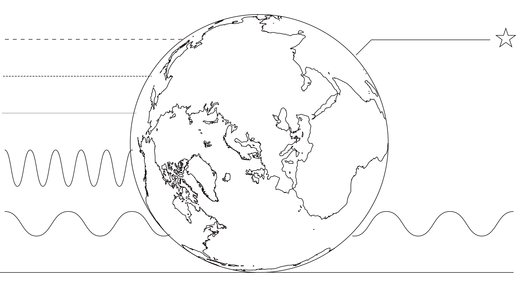
An image is a message. It’s an effective way to leave an imprint on the audience. We use images to convey perspectives, situations or emotions that can’t be communicated through text or discussion alone. We bring complex topics to the context of daily life and we take topics from daily life into a broader social context.
In Sitra’s communications, images are not just attractive visual elements – we use them to get our message across more effectively. With this in mind, we do not use them as filler. If an image does not enhance the message, create moments of insight or evoke emotions, we will not use it.
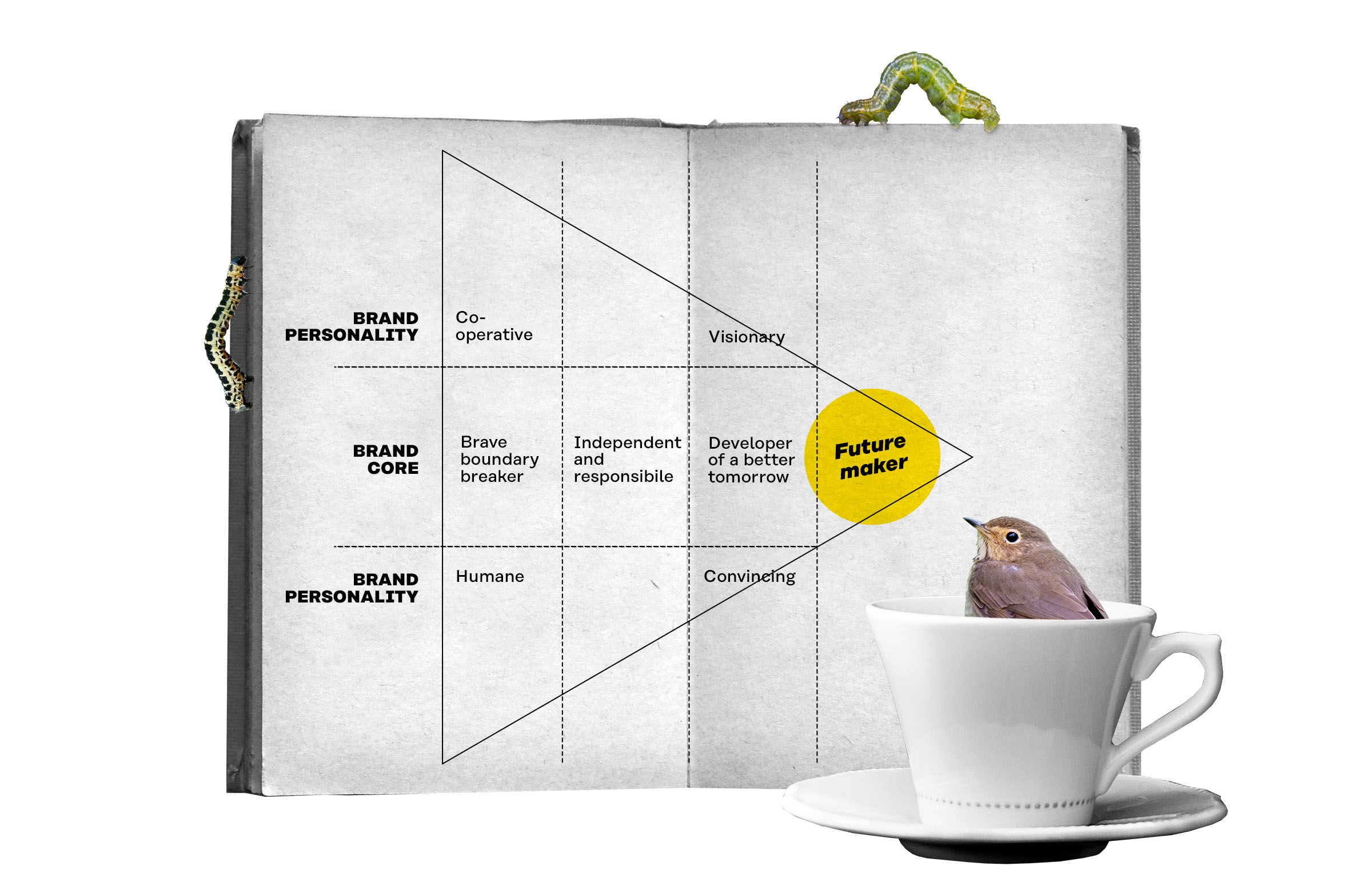
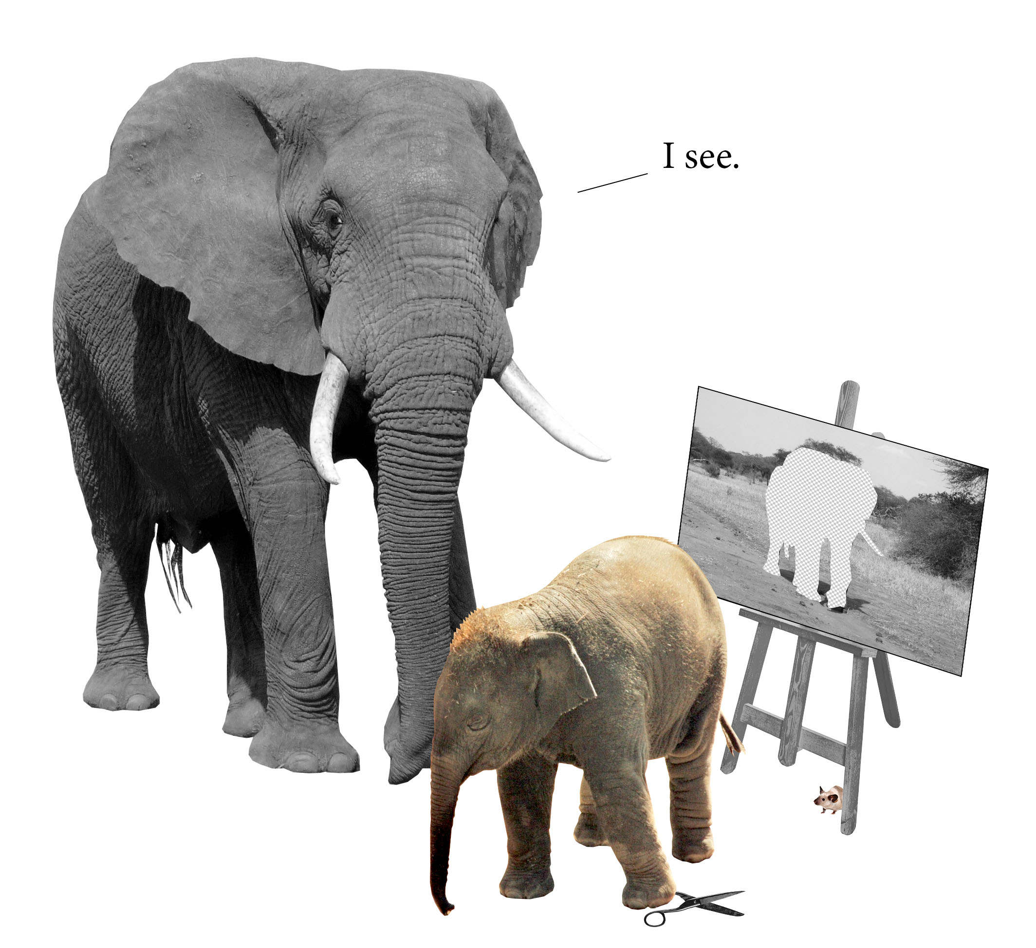
How do we illustrate the future?
- Familiarise yourself with the topic. What is the message you want the illustration to convey?
- Review existing material. If the picture is part of a larger set, find out what established elements have been used before. If they are effective, make use of them.
- Start with a creative idea. What metaphor or new perspective would make the message shine? What idea would cause a light bulb moment in the reader?
- When the idea is clear and sharp, put together the picture elements (“the actors”) by cutting them from old pictures or pictures taken specifically for the purpose at hand.
- Think about the colours. Do the colours of the picture support the intended message? Is the emphasis on the right things? Is the picture part of a larger set in which colours were used in a particular way?
- Combine the picture with text or a comment. Note that the picture and the text are inseparable. Consider the option of starting the idea generation in step 1 together with the person who is writing the text.
- Test it with your colleagues! What ideas does the picture bring to mind? What story does it tell? If the end result does not match the message you want to convey, start again.
Shapes, lines and surfaces
Alongside pictures, we mainly use basic geometric shapes as graphic elements. We particularly use circles, triangles and quadrilaterals, but other regular shapes can also be used.
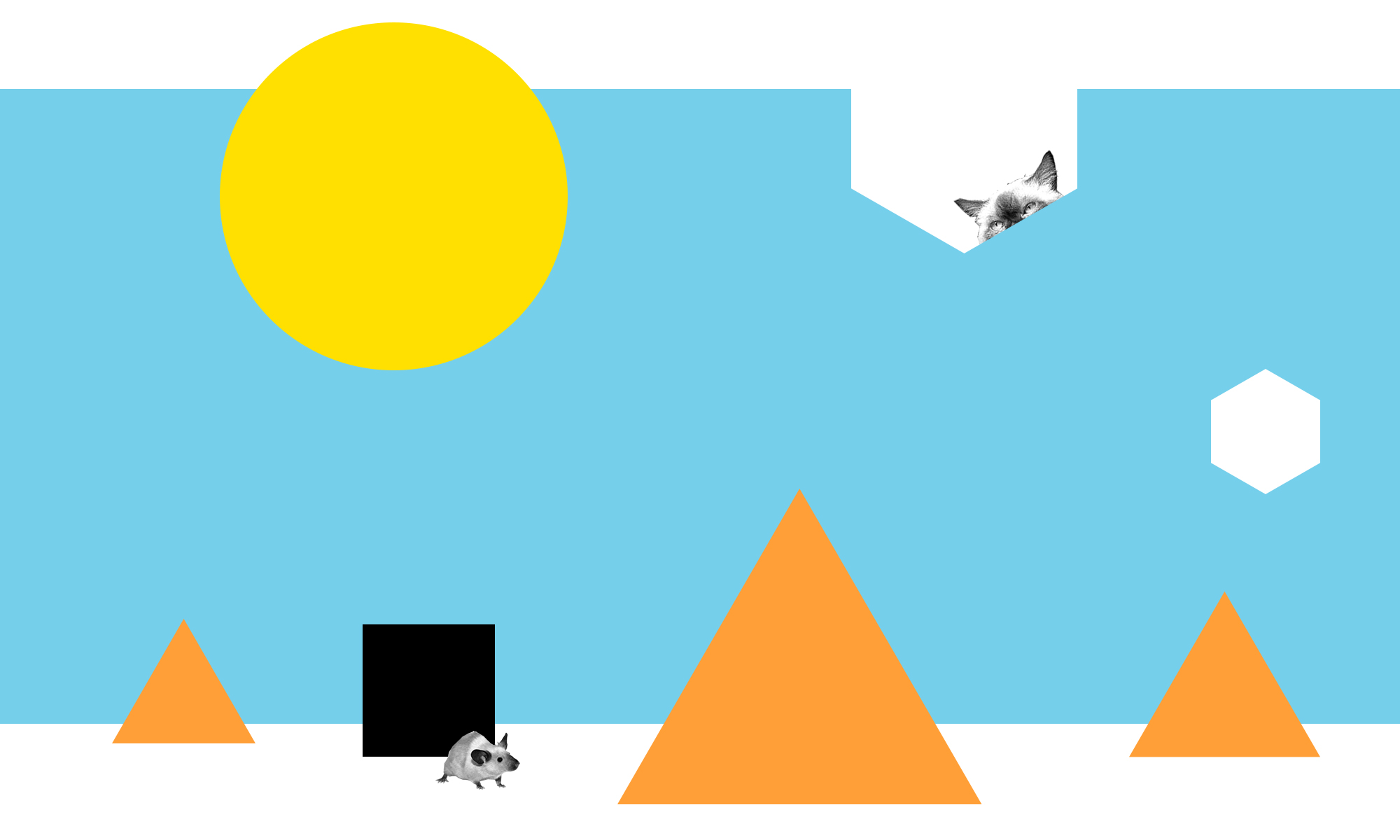
In Sitra’s brand style, thin lines are used to indicate boundaries between areas and show connections. We use thin lines in contexts such as maps, tables, charts and the Sitra website to separate elements from each other.
One colour is always used on one surface. We do not use sliding colours and we do not purposely texturise surfaces.
Colours
The purpose of colours is to draw attention and highlight content as well as to bind pieces of content harmoniously together – or, conversely, to indicate a strong separation between them. Colours can be used in a way that is calming or exciting. Words matter, and so do colours.
Main colours

Auxiliary colours

Sitra’s colour palette is based on black and white. This doesn’t mean that we present things as being figuratively “black and white”, or “either/or”. It simply means that our visual identity must be recognisable even when colours are not used.
Colours and accessibility
Text contrast that satisfies Level AA of the Web Content Accessibility Guidelines is achieved when black or white text is used with colours in accordance with the examples shown in the colour palette (Aa).
Notes to graphic designers
- In print, remember to add other colours to 100% black in accordance with the printing machine’s “rich black” recommendations.
- The blend mode we primarily use is multiply.
- We do not use grey tones as large single-coloured surfaces.
- There is no single right way to use colours as long as their use is justified, clear and fairly consistent.
Typography
Strong typography is an inseparable element of Sitra’s visual style. Clear and accessible basic typography serves all kinds of readers and anchor words typeset in large type are used to structure the layout, deliver information, support productisation and create art.
Fonts in print and online
- Headings: Rational Black (Italic), Rational ExtraBold (Italic)
- Leads: Rational Light (Italic)
- Body texts: Minion Pro Regular (Italic), Minion Pro Bold (Italic)
- Body texts in bold: Rational ExtraBold (Italic) (the text size for bold is 0.9 relative to body text)
- Citations: Rational Light Italic
- Auxiliary texts: Rational Medium (for dates, captions and other metadata)
Fonts for presentation slides
- Headings: Arial Black, Arial
- Body texts: Georgia Regular (Italic,) Georgia Bold (Italic)
Fonts in MS Office documents
- Headings: Arial Bold (Italic)
- Body texts: Arial Regular (Italic)
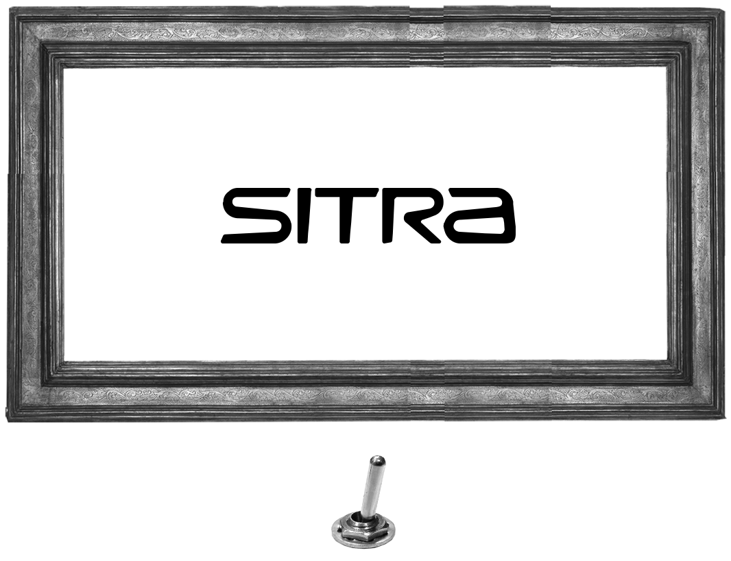
Logo
There are two versions of Sitra’s logo: one black and one white. Consider the general tone of your picture or background when choosing which version of the logo to use. You should have sufficient contrast between the logo colour and the background for the logo to be clearly visible. Download Sitra’s logos.
When a partner’s logo is displayed with Sitra’s logo, the recommendation is to use the same colour version as Sitra’s logo (either white or black).
The isolation area around the logo must be at least half of the width of the letter S in the logo and the minimum size of the logo is 20 mm. The logo can be placed in any corner or at the centre of a horizontal line. If the logo is the main element on a surface, it is placed in the middle with the slogan.
Restrictions on use
- To ensure that it stands out clearly, the logo must not be placed on a busy picture or coloured surface.
- The shape of the logo must not be altered in a way that makes it lose its original dimensions.
- Adding elements to the logo is not allowed. This means that there mustn’t be any special effects or additional elements inside the isolation area that would change the original structure of the logo.
Sitra’s logos are intended to be used with texts and publications related to Sitra. Please contact Sitra’s communications team before using Sitra’s logo and send an example of the text, publication or video in which you intend to use the logo. Sitra’s communications team can be reached by phone on +358 (0)40 548 0794.
Partner communications
In Sitra’s future-oriented work, co-operation is the default approach rather than an occasional option. No single individual or organisation can achieve major changes alone. Everyone must do their part. Our focus is always on the most important thing, which is content. As such, we do not produce separate visual identities for projects or events.
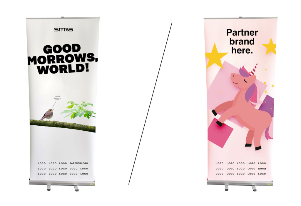
The main principle for project and event communications is to always use the visual style of the organisation that has the primary responsibility for the project or event, and to add the partners as logos or text. When logos are used, it is important to use text to indicate the role of the partner when the partner is not the organisation that has the primary responsibility for the project or event.
Only projects or events of exceptional strategic importance can have their own emblem based on Sitra’s typography. In that case, the name is displayed in the materials as a title or topic, never as an entity that takes action or as an emblem that is equal with Sitra’s logo or the logos of partners. Sitra’s staff always represent Sitra, never a project, for example.